Facebook is slowly rolling out changes to the business page layout. Don’t panic! While not major, these layout changes can impact your customer conversions and make you more successful on social media.
Get more engagement from the call-to-action button
Since last year, business pages have had the option to select from a group of calls-to-action (CTAs.) For example, you can have a Sign Up or Shop Now button featured at the top of the page. With Facebook’s new layout changes, the CTA is moving to the top left of the sidebar. Find it just below the profile photo on both desktop and the mobile app.
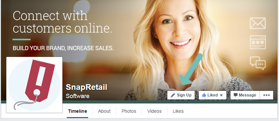
The current Facebook layout has a less obvious call-to-action (CTA) button. With the new Facebook layout (in the image below,) the button is featured prominently below the profile picture.
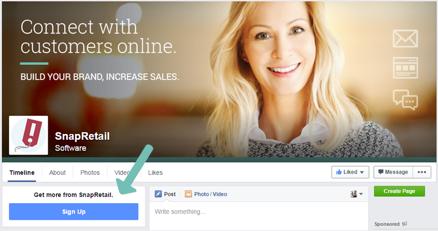
What does this mean for your marketing? With these changes, this button is more obvious and helps to drive conversions for a specific goal. For example, if you are running an event, you have the option to select the Book Now button. With a larger button, you’re able to run a promotion and encourage customers to book for the event. Hoping to gain even more traffic? Facebook is lets you pay to advertise this CTA button too.
Facebook changes come to mobile
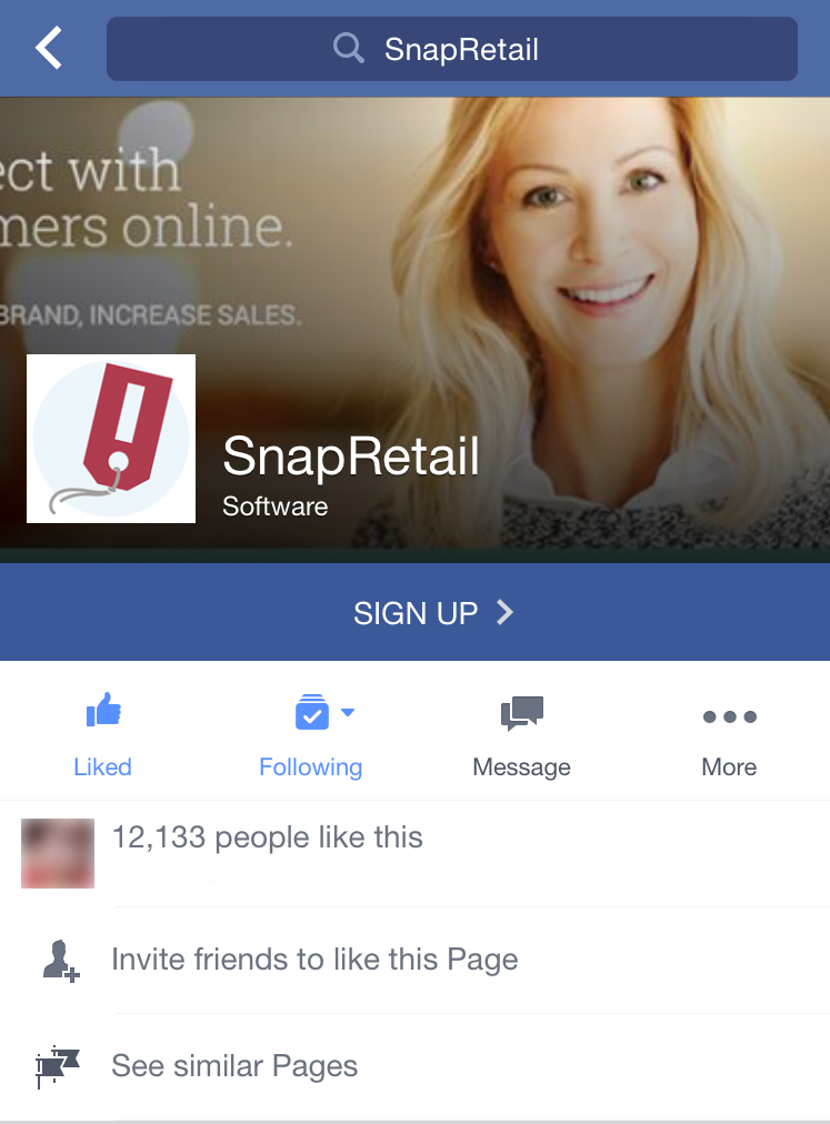
The changes for the CTA button don’t just stop at the desktop level. Facebook users viewing the page on a mobile device will also see a slightly updated view which places the CTA front and center. That news cannot be any better for businesses. According to Facebook’s fourth-quarter earnings report, 526 million of its total active monthly users access the site from mobile (up from 456 million in the previous quarter). This change means that anyone viewing your business will see the button instantly and that can be a major advantage to help drive conversions.
Other buttons move below the profile photo
While not as dramatic as the CTA change, other buttons such as: Like, Message, and Share have been moved to below the cover photo. This change de-clutters the cover photo.
Smaller profile photo
Eagle-eyed retailers will also notice that the new Facebook layout moves and shrinks the profile image. The new dimensions are set at 88px x 88px, including the white boarder (significantly smaller than the current size of 180px x 180px.) Do you need upload a new photo? For now, no. After clicking the smaller photo, customers will still see the full size version.
Unlike previous changes that required retailers to completely change their business page, these updates are both simple and effective. Keep an eye on your Facebook business page! These changes are already starting. You could be next!





Leave A Comment