As a small business owner you are expected to wear many different hats. You don’t have to be a wizard in all areas such as marketing, accounting, HR, but it is great to have certain knowledge to ask the right questions so you can effectively direct the right people. This is no different when it comes to graphic design. This article will help you with your logo design project, whether you are designing your own or hiring a professional to help create your branding vision. Stick to these basic principles and you will end up with a logo you can be proud to show off to your friends, family and customers.
Keep It Simple
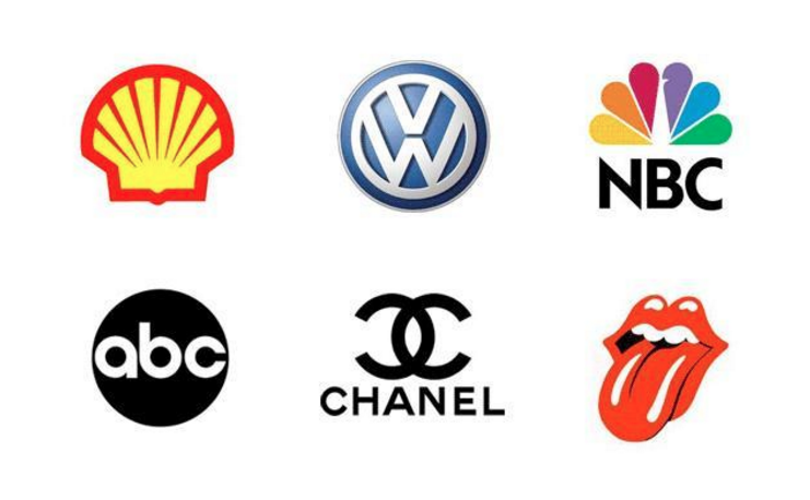
The purpose of a logo is to give your business a visual identity and integrity that is easily recognisable and memorable. The most memorable logos are also the simplest ones in design. The quality of a logo is not measured by the advanced illustration techniques and detail applied but how memorable it is. Small business owners should look at famous brands for guidance and remind themselves to keep it simple.
Choose Your Colors Carefully
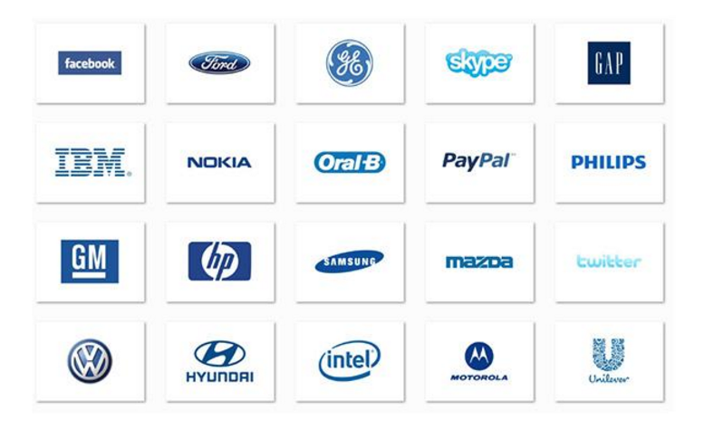
Color is a very effective tool to communicate emotion. A lot has been written on what kind of emotions different colors trigger. For example blue is the color of the sky and sea. It is often associated with depth and stability. It symbolizes trust, loyalty, wisdom, confidence, intelligence, faith, truth, and heaven. It is no wonder so many companies use at least some blue in their logo.
It is important to keep in mind not to overuse color the design gets too busy otherwise and starts to look unprofessional. An important rule of logo design is not to use more than 2-3 different colors.
Make Sure it Looks Good in Black & White
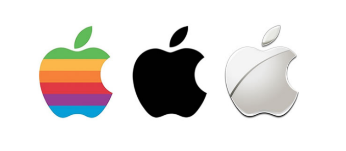
It’s important that your logo passes the black and white test. In some publications, print or web you don’t have control over whether the logo will be displayed in color or black and white. You want to make sure your branding is consistent and still looks great when customers or leads see it in black and white. A logo that looks great in black and white typically also meets the simplicity criteria.
Choose the Right Fonts
Similar to color, fonts are a powerful tool to communicate emotion. Different fonts evoke a different response so you should choose them carefully. What’s difficult with fonts is that there are thousands of options and usage licenses to make things even more complicated. To learn more about typography this is a great starting point. A rule of thumb is also not to use more than two, never more than three, different fonts in your logo design. Using different typeface can be effective but overdoing it will complicate your logo and make it look less professional.
Make it Scalable
It’s great to have a logo that looks nice in the top left corner of your website or on a letterhead but what happens when the dimensions and scale change? You need to make sure your logo scales up and down in size without losing quality. Will your logo look great as a small web thumbnail and will it hold up equally as well on a billboard in the middle of Times Square or on the side of a bus? Very detailed designs won’t work well on a small scale, which is why simplicity is so important. Scalability can easily be achieved with simple logos.

Create Something Timeless
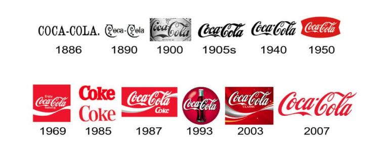
When you create your logo ask yourself if it will stand the test of time. You want a memorable logo that is still relevant in one year, five years or ten years down the road. Most companies tweak their logos as they grow, which is ok and even encouraged, but you don’t want to have to deviate completely every time. A timeless design is achieved by following the rules outlined above and by staying away from heavy effects, gradients or other design trends. These are the design elements that will make your logo look dated quickly.
The basic tips covered here are good principles to follow when designing your own logo or providing feedback to a graphic designer working on your brand. It’s easy to want to overdo, adding more details and more effects, but that doesn’t mean your logo will turn out looking more professional. Less is more, which is especially true when it comes to logo design. To remind yourself of that look at your favourite brands and you’ll notice the majority of them went for simplicity.



Leave A Comment