Another day brings with it another change from Facebook. This time, it’s affecting the overall look and feel of your Facebook Page on desktops. So what are the most important changes you need to know in order to make this a smooth transition? Read on!
New streamlined, two-column layout
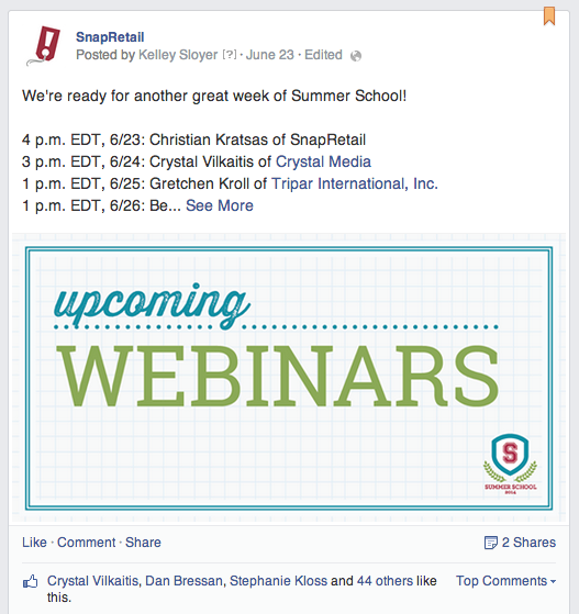
At first glance, the most obvious change is the new two-column layout. The right-hand column of your Facebook Page is devoted solely to posts that you make to the Page, including any that you’ve scheduled from your SnapRetail account. This new design makes it easy for customers to navigate your posts in order by date. It’s also a great tool for you. Encourage your fans to go back in time on your wall and scroll through to find anything they’ve missed as it’s much easier to digest posts in a row than bouncing back and forth on the screen.
The sleek, new layout does come with one downfall. While you’re still able to “highlight” a post, doing so will only add a flag to the post, it will no longer span your Page as it had before. But don’t worry; your posts will still stand out because the two-column layout allows for larger posts.
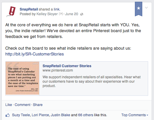
If you’d still like to capture your audience’s attention with a specific post, you have the ability to feature it at the top of your Page by clicking on “Pin” it. Try to update your pinned post regularly, especially when you have information about new arrivals or an exciting sale to promote.
Depending on your business type (brick-and-mortar vs. online), the order of the vital information in your left-hand column may vary. For brick-and-mortar stores, Likes and visits, your map, phone number and hours of business will appear first, followed by apps, photos, videos reviews, post to your Page and Liked Pages. For online stores, Likes and information about your business will appear first.
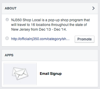
Facebook gives you some flexibility to customize the order of this information. Almost all of the sections in this column can be shifted up or down, but a few are required to stay in their assigned slots. To move a section, simply click on the pencil in the right-hand corner and click “Manage Sections.” Then, in the pop-up, click, drag and drop a section you wish to move, like Reviews, into its new spot. Speaking of Reviews, we recommend that once you’ve earned a handful of positive review to move this section to one of the top spots in your column. There is no easier way to create a new customer than through a great review of your store! The next section you should consider moving to the top is Apps, especially if you have an email collection app. By bringing apps to the top of your column, you’re keeping your email collection app top-of-mind and noticeable to your customers. SnapRetail customers, that’s great news for you!
New Like box for visitors
Facebook has added a pretty cool feature that encourages visitors to Like your Page. If the visitor is new and has not liked your Page, a navigation bar with the Like button will follow them down the screen as they scroll. Facebook has even gone the extra mile and included an enticing message in the box that reads, “Get updates from
New insights into your competitors
Additional insights have been added into your Pages to Watch section. Once you click on “Insights,” scroll down to see how your Page stacks up against the competition. The four statistics you’ll receive for all the pages you watch are Total Page Likes, New Page Likes, Posts This Week and Engagement This Week, compared against your own Page. If you notice a competitor has a spike in engagement or Likes, visit their page to see the types of updates they’ve been sharing. It could spark an idea for your store!
New higher profile image
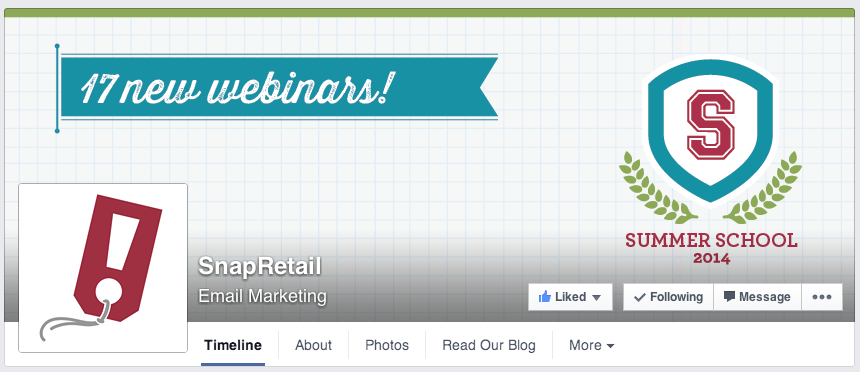
You may have overlooked the final update to the top of your Page. Facebook has moved the profile image on your Page slightly higher into your Cover Photo. Check to see that this new position is not covering any important pictures or text in your Cover Photo, along with the Like, Follow and Share buttons that have been moved onto it, too.
It may feel cumbersome to keep up with Facebook’s ever-changing layouts, but the end results of this update will make your Page easier to navigate. And that means it’s easier for your customers to stay abreast of everything important going on in your store.




Leave A Comment